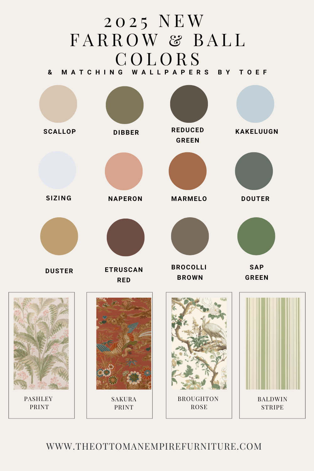
Farrow & Ball 2025 Colors & Wallpaper Pairings You’ll Love
Here’s how these 12 brand-new paint colors beautifully harmonize with exclusive wallpaper designs from The Ottoman Empire Furniture.

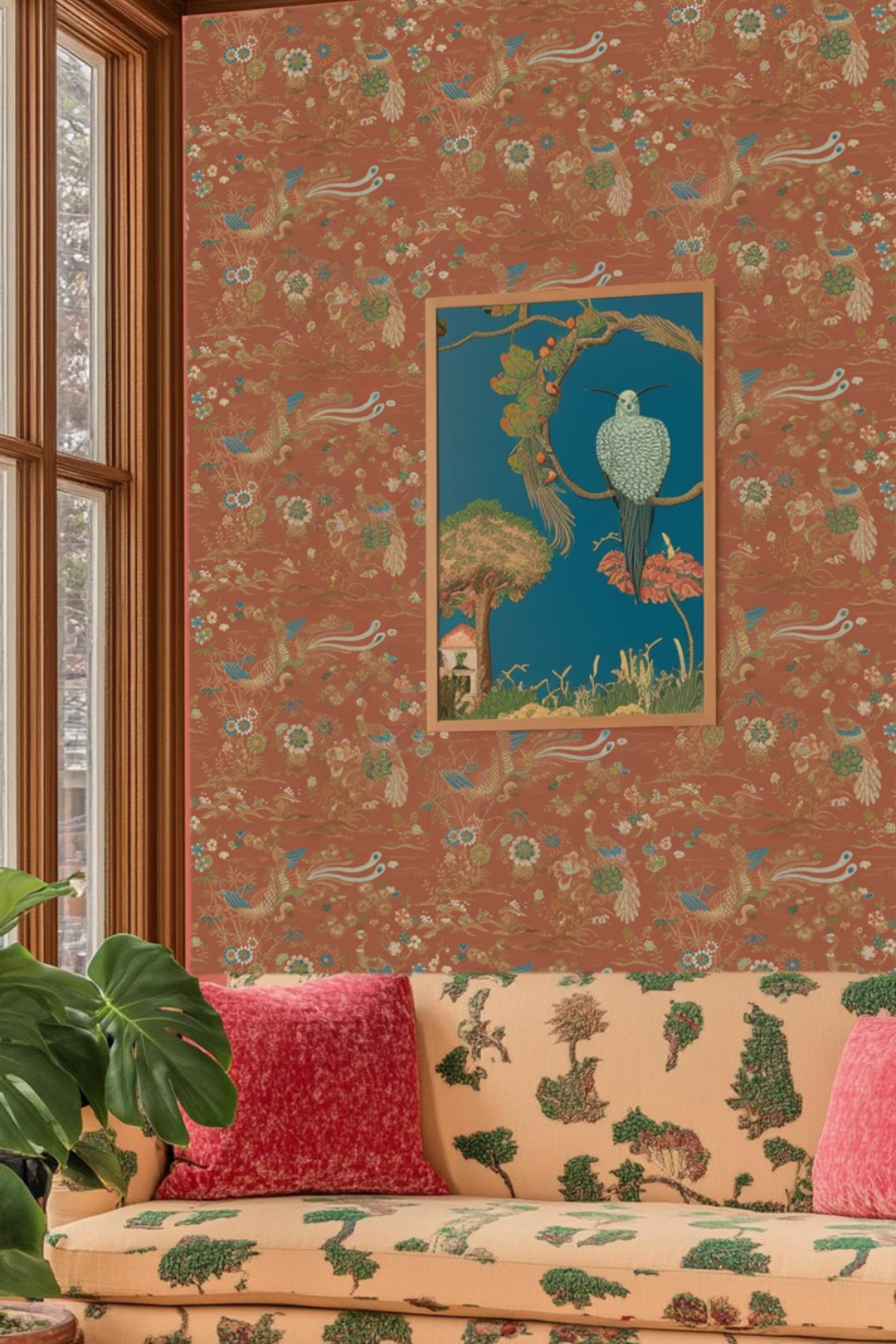
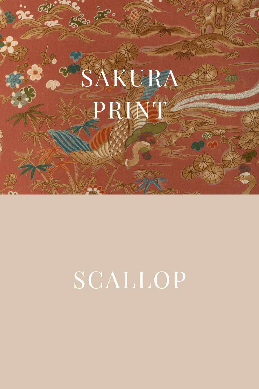
1. Scallop + Sakura Print
A soft, warm off-white, Scallop carries subtle peachy undertones, making it the perfect backdrop for intricate floral motifs. Our Sakura Print wallpaper enhances its depth with delicate pink hues, bringing a fresh yet classic appeal.
Why it works: This combination is a dream for elegant bedrooms and serene living spaces, offering a soft contrast without overwhelming the room.
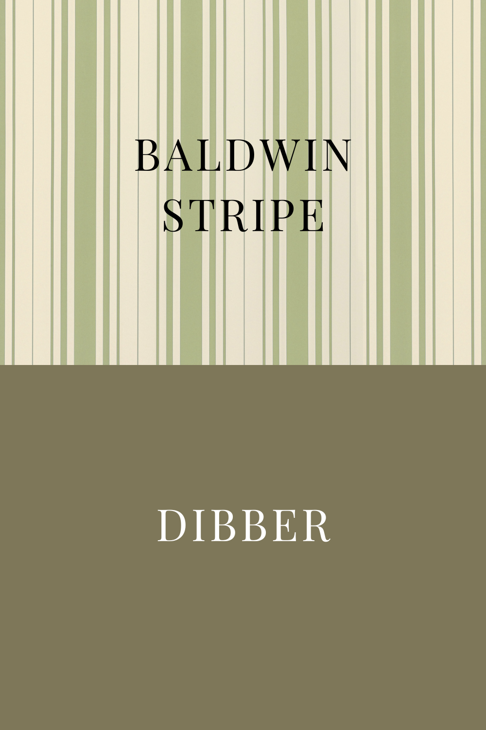
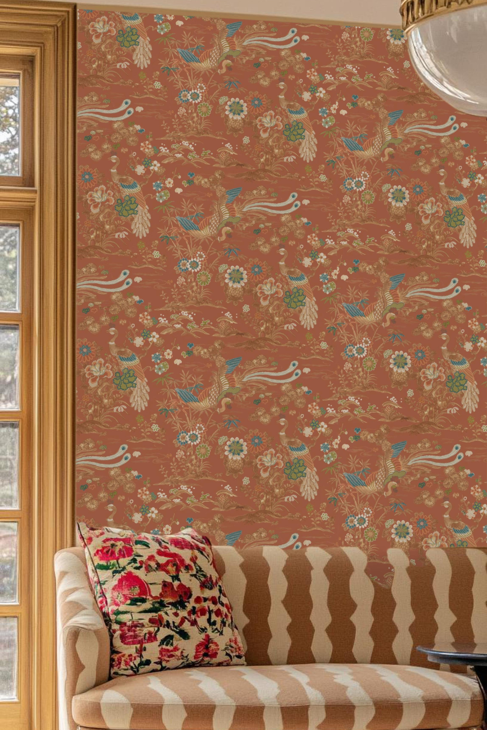
2. Dibber + Baldwin Stripe
Dibber, a deep terracotta-inspired red, pairs beautifully with Baldwin Stripe wallpaper’s refined, structured pattern. This duo adds a sense of timeless sophistication, perfect for classic homes with a modern twist. Learn how to pattern drench with it here.
Best for: Statement dining rooms and cozy, intimate lounges.

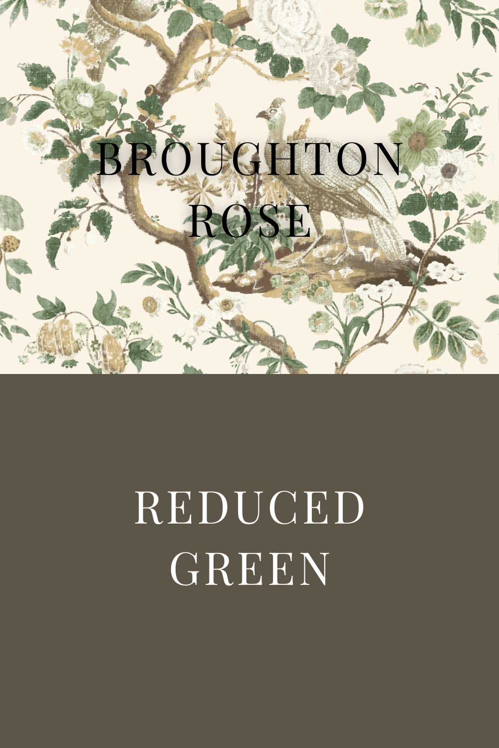
3. Reduced Green + Baldwin Stripe
For lovers of earthy, heritage-inspired interiors, Reduced Green’s muted olive tones align effortlessly with Baldwin Stripe’s crisp pattern, evoking an English countryside aesthetic.
Best for: Offices, libraries, and moody, pattern-drenched rooms.

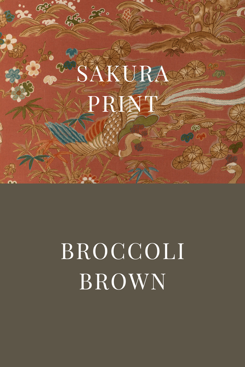
4. Broccoli Brown + Sakura Print
A rich stone brown, Broccoli Brown feels warm, grounding, and organic, especially when paired with Sakura Print wallpaper’s floral details. Together, they create a balanced fusion of earthy and delicate elements.
Best for: Cozy nooks and contemporary spaces that need a touch of natural warmth.

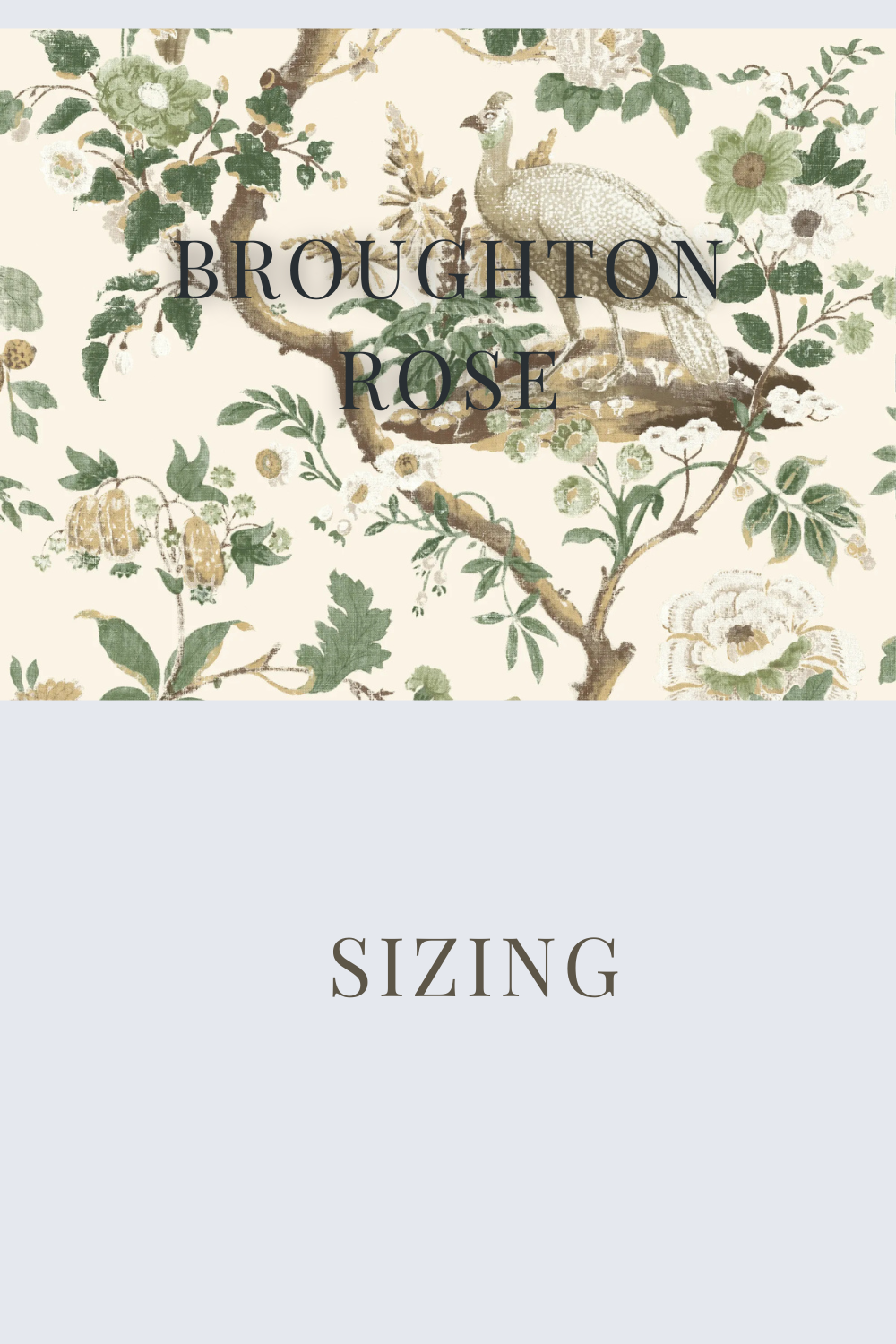
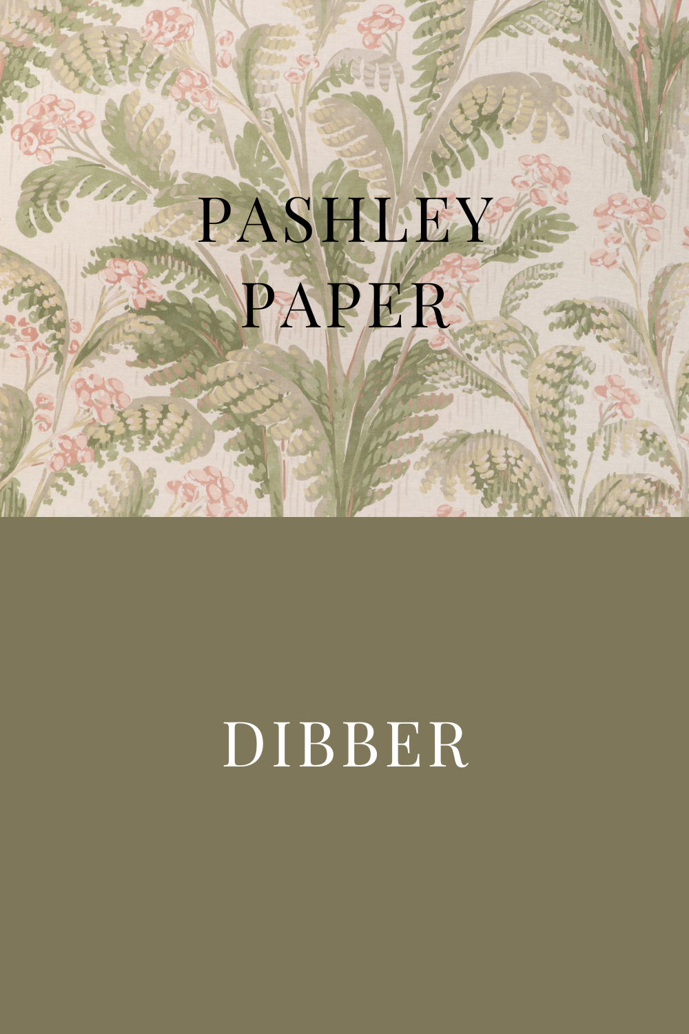
5. Sizing + Broughton Rose
A crisp, airy white with blue undertones, Sizing adds freshness to the intricate designs of Pashley Paper. This combination is ideal for those who love a light-filled, tranquil interior.
Best for: Entryways, sunlit breakfast nooks, and classic yet modern living rooms.
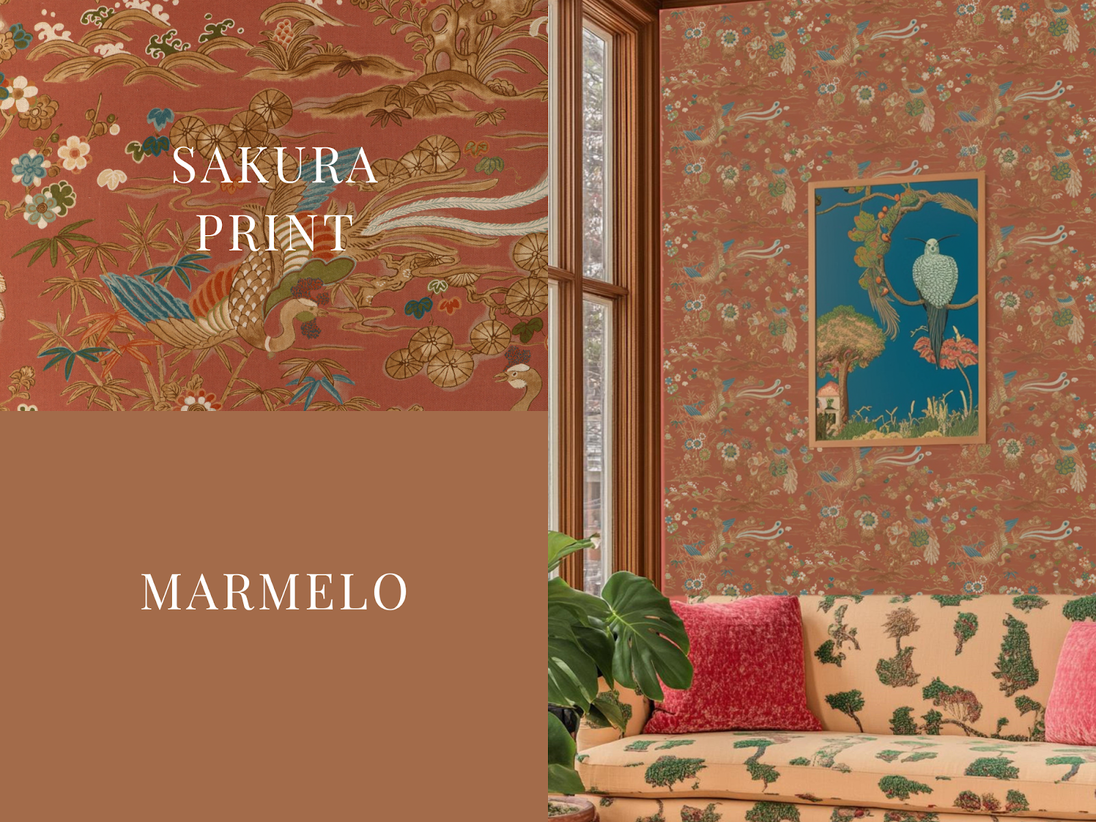
6. Marmelo + Sakura Print
Marmelo’s deep golden ochre offers a bold, warm canvas that makes Sakura Print wallpaper truly pop. A blend of historic charm and modern energy, this duo brings vibrancy and warmth to any space.
Best for: Creative spaces, bohemian-inspired bedrooms, and maximalist interiors.

7. Douter + Baldwin Stripe
For those drawn to a more minimal, structured aesthetic, Douter—a soft, cool-toned neutral—lets Baldwin Stripe shine while providing a clean, contemporary balance.
Best for: Scandinavian-style homes and modern-traditional spaces.
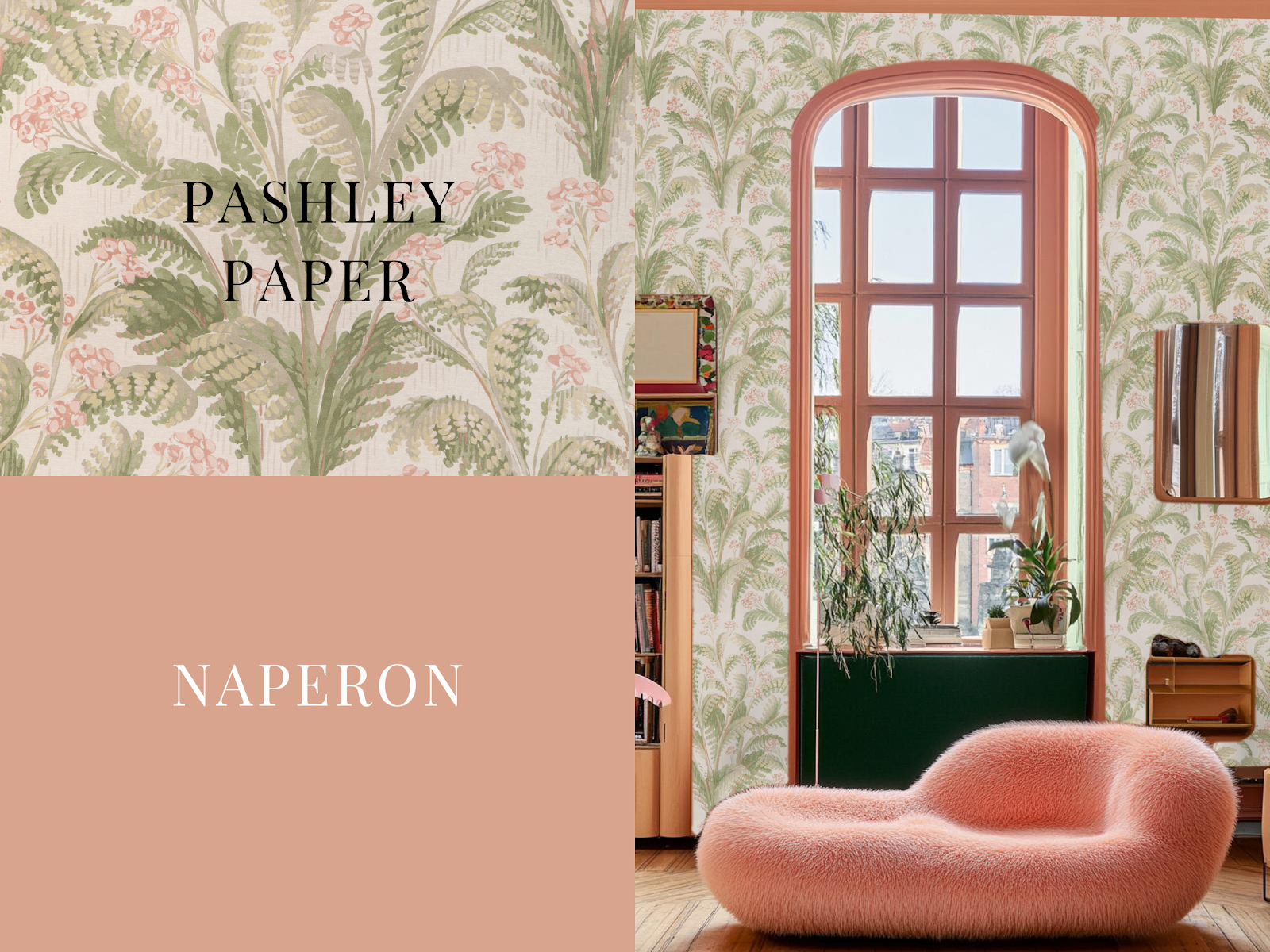
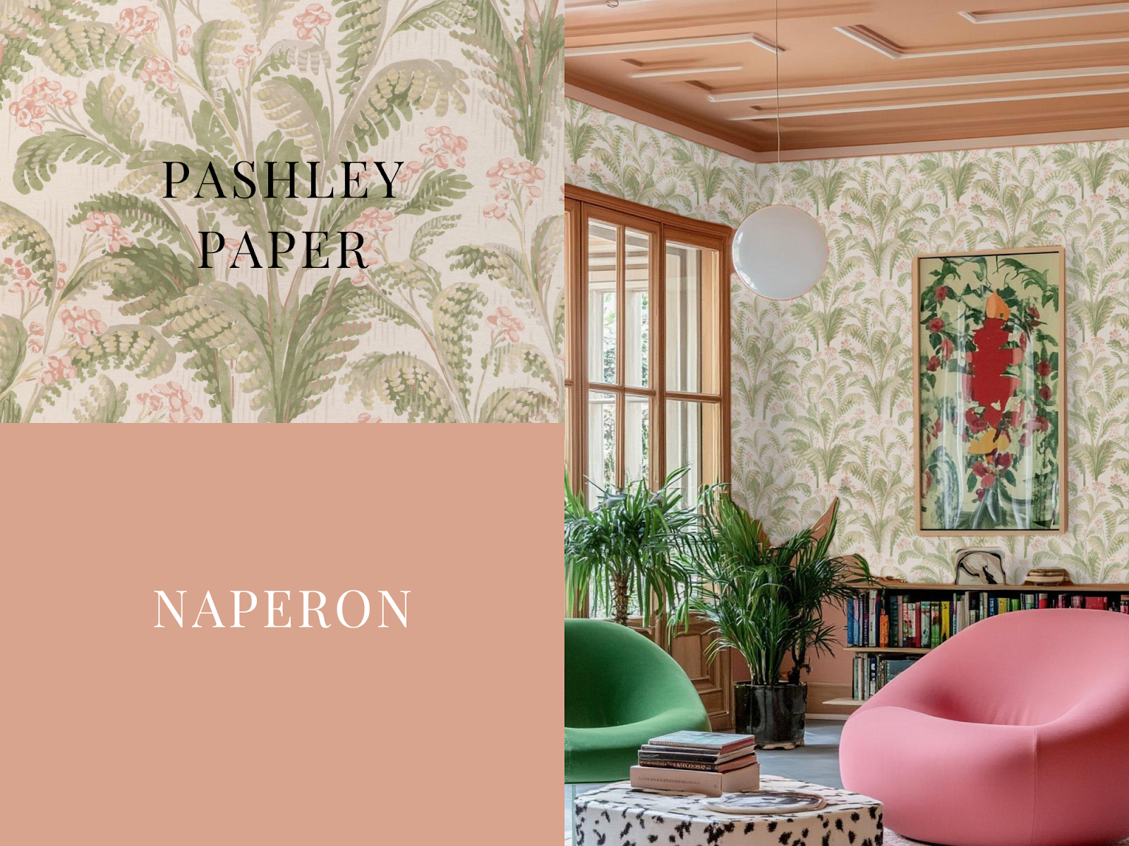
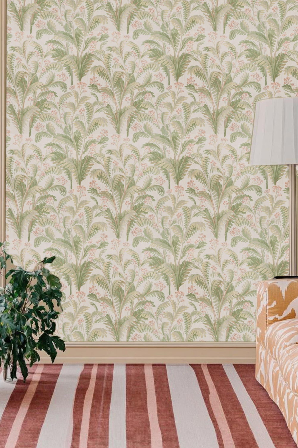
8. Naperon + Pashley Paper
Naperon’s buttery, warm yellow creates a cozy backdrop for Pashley Paper’s intricate detailing, bringing an old-world European charm to interiors.
Best for: Elegant kitchens and historic-inspired sitting areas.

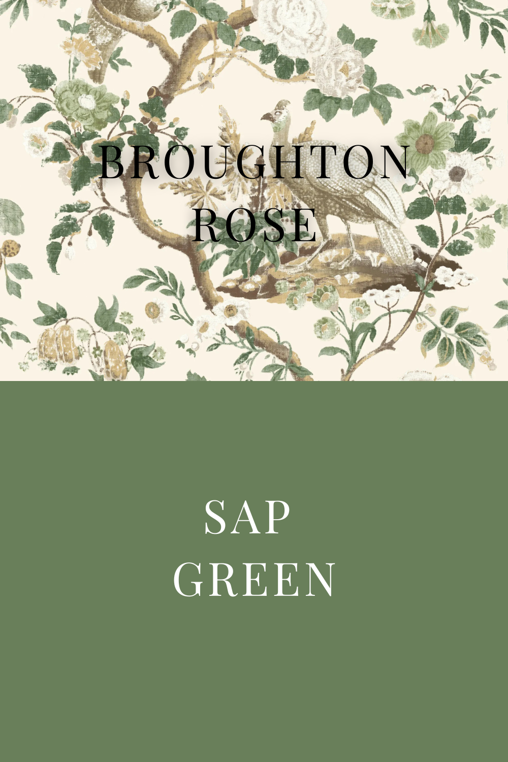
9. Sap Green +Broughton Rose
The deep, forest-like richness of Sap Green enhances the structured contrast of Broughton Rose, creating an effortlessly luxurious and layered aesthetic.
Best for: Bold home offices, high-end boutique spaces, and statement walls.
How to Use These Pairings in Your Home
Not sure how to bring wallpaper and paint pairings into your space? We break it down in our expert guides:
-
How to Mix and Match Patterns – Perfect if you’re hesitant about layering bold prints and colors.
-
Pattern Drenching 101 – Learn how to fully embrace immersive wallpaper and color schemes like a pro.
Why This Matters for Designers:
Farrow & Ball’s 2025 collection is set to be one of the most searched color launches of the year. By featuring these pairings early, you’re getting ahead of the trend, ensuring your home or project aligns with what’s next in the design world.
Want to shop these wallpapers and paints together? Keep an eye out for the official launch on The Ottoman Empire Furniture.